Daily App Habit Formation

Habit Formation: The Routine of Daily App Use

According to a scientific study, it can take about 18 days before people can form a new habit. And it takes 66 more days for this habit to become a reflex action. If you take this in the context of mobile app use, you can say that it’s quite easy since daily app use is about 56% of smartphone owners and 26% of tablet owners.  With an average usage time of 30 hours a month, you can say that app use is already habitual.


That is good, right? A majority of smartphone users basically have a daily app habit. There’s a “but” though: are these users returning to the same app day in and day out? This is actually an important question. As an app publisher, you want your app to be sticky – to be addictive. So you want your app to be the app that users return to every day.


There’s a science to how apps become addictive. It basically boils down to “triggers”, actions and cues that can get an app user hooked to the app. But triggers are useless if there are any positive reinforcement in the form of rewards. It’s a cycle of trigger, hook, and reward. But how can an app effectively execute this cycle to the point where triggers are no longer necessary, where app use basically becomes as natural as brushing one’s teeth?


Some of the Ways Apps Use to Hook Users

  1. Personalization options don’t just give users a sense of ownership but also a sense of control. They can decide to some extent what content they want to access, how and when to access it. The more the app is aligned with their goals, needs, and schedule, the easier it is for them fit the app into their daily routine.
  2. Provide entertainment value. Humor is one way to deliver an engaging content, but it isn’t always applicable especially with content like news.
  3. Repetition of simple actions. The less effort the brain exerts on thinking about trivial things, the more efficient it is on solving complicated things. And since routine tasks take little to no mental effort, the brain’s reward receptors activate every time we perform these tasks, conditioning us into performing it often.
  4. Replacement of an existing habit. It is easier to replace an existing habit or behavior than creating one. With the advent of technology, especially of apps, a lot of habits like note-taking had been digitized.
  5. Constant reminders. Most successful apps utilize simple but effective re-engagement strategies. One of these strategies is the use of push notifications. This regular stream of updates gives the illusion of new information, reigniting the user’s interest in the app.


Brands that are Part of Users’ Daily App Habits

There are apps that are designed to cultivate new, good habits in users. But there are also apps you least expect to stick on you. These are apps that somehow have a straightforward function and features, yet you find yourself developing a habit of daily app use. Soon, you notice that the app itself had become a part of a daily app habit you can’t just shake off.


Let’s take a look at how these three apps became so addicting:

  1. Poncho Weather App

Fun is a word you won’t normally associate with a weather app. But Poncho somehow pulled it off. This weather app delivers daily weather and traffic alerts through text, in-app messaging, email, and more. Aside from the ease of its multi-channel and multi-platform integration, Poncho gives a personalized, witty, and somehow cute updates. The app’s eponymous mascot, Poncho the cat gives the app a cute touch without crossing the line and appearing girly. The various pop culture references and puns also give an upbeat and current feel. Aside from the entertainment value it provides, the Poncho app is also big on personalization. It asks users for information that is relevant to how they want to use the app and how the app can help in their daily lives. Users can also schedule updates around their daily routine.

  1. Starbucks App

Many experts consider the Starbucks apps as the pioneer in the implementation of mobile payments for retail outlets. Who knew that something as innocuous as ordering a cup of coffee can evolve into a profitable digital venture? Transactions on the Starbucks app account for over 50% of all company-owned store transactions in the U.S. What it basically did was replace one part of a lot of American’s routine: waiting in line at cafés.

  1. Snapchat

The people behind Snapchat revealed that their main user demographic of 18-34 years old are “…more likely to follow trends.” This may mean that they are basically teetering on uncertainty, that their users may leave them any moment because they are, by nature fickle-minded. But here they are, with 161 million daily active users by the fourth quarter of 2016. Even if that number steeply declines by the first quarter of 2017, it’s still undeniable that Snapchat has staying power – it’s the daily app of choice for its target demographic. Not just that, but the app’s users are so into it that they open the app more than 18 times a day. All sessions last from 25 to 30 minutes.


The app has a very effective “hook sequence” that its targeted users find very rewarding. It has a certain novelty that other messaging apps cannot provide. The reward of just seeing random “Snaps” is enough for its users to actually replace other modes of communication. A 2014 data on college-age Snapchat users reveal that 37% use the app for “creativity” purposes. About 27% use it to keep in touch and 23% said that it is “easier than texting”.

Reviews Opinion Mining

Opinion Mining: Digging Deep Into App Store Reviews

A Treasure Trove of Data

Amidst the all-caps rants and troll infested app store reviews is a mine full of market research data. A lot of app publishers and marketers actually know about the potential of app reviews. It is not only important in the context of the app the reviews are for, but also for future app development endeavors. But in order to harness the potential of app store reviews, a process called opinion mining or sentiment analysis is necessary.


The terms opinion mining and sentiment analysis are often used in different contexts. But they both used to describe a process of systematically extracting subjective information from a body of text. Nowadays, there’s a niche for opinion mining in social media networks. Twitter, for example, uses opinion mining to determine people’s reactions on a trending topic. These reactions can be classified into three polarity aspect: positive, negative, and neutral.


In the context of an app store review, opinion mining seems the straightforward analysis of users’ satisfaction. If a majority of the reviews is positive, then great, right? If it’s negative, what else can we do about it? But most of the time, these users actually want to tell you what they want, not only with your app but also in apps with the same functionality in general.


Why Bother with Opinion Mining?

Aside from the aggregation of important feedback, opinion mining can also benefit marketers in different ways:

  1. Opinion mining is helpful in the early stages of app development, especially as you are building the app’s concept. It can give you insights on the market or niche of your app.
  2. Digging deeper, you can find information on specific features or functionality that don’t work for your target audience. That is even before you get into the beta-testing phase!
  3. You can evaluate the cause of both your success and failure. You can actually use app store reviews as some sort of benchmark that can give a picture of how a successful app should look like in the perspective of users. For example, app store reviews and ratings are important considerations in downloading an app. For every negative review, the app’s chances of download decrease. Also, a game app with a lot of downloads doesn’t necessarily have satisfied users. This can result in poor retention and therefore, low revenue in the long run.
  4. You can generate previously overlooked keywords using app store reviews. You can find targeted keywords well-hidden within positive reviews. There’s also the added bonus of these keywords having less competition.


Tools for Opinion Mining

One basic strategy in opinion mining is to group app store reviews according to sentiments. These sentiments are basically keywords that fall under the category “unambiguous affect words”. Words like “happy”, “sad”, and “bored” fall under this category. This approach to opinion mining or sentiment analysis is called a “knowledge-based technique”.


More advanced knowledge-based techniques are not easy to perform and evaluate, though. You can trawl for these keywords manually with the use of filters. This technique can take some time and effort so it’s not practical to use in analyzing real-time sentiment.


There is also a statistical technique that uses machine learning, specifically deep parsing of texts. Automated tools offer more accurate results and more versatile processes. You can create your own tool which can cost a lot of time and money. There’s also App Annie where you can export a spreadsheet of reviews from a specific date range, app version, and country. There are also opinion mining tools for a fee. Most of these tools are geared towards social marketing, though.


You can, of course, use a hybrid technique that combines both the knowledge-based and statistical techniques.

Big-Budget App Marketing Blunders

App Marketing Fails

It is common knowledge that only a few apps make it to the App Store charts. Over the years, it seems that big-company apps rule the charts. These companies have all the resources especially budget-wise. The advantage is quite obvious especially in terms of marketing. But even with the seemingly unlimited resources at their disposal, big budget apps aren’t immune to marketing blunders. From not even considering any marketing, marketing to the wrong audience, and not living up to the hype – you’ll be surprised how these simple marketing blunders can spell the app’s failure.


Everpix: No Marketing

The developers of Everpix weren’t “sales people”. They believe that the app will sell itself which is very common in the early days of app development where the common mantra was “If you build it, they will come”. A lot of app developers see those times as an eye-opening experience. Everpix though, made one of the costliest (non-) marketing blunders of the nascent years of app development.


33cube Inc., the Everpix’ development company gained $1.8 million from investors in 2012. The entire amount went mostly to the app’s development. The company spent a little to nothing on advertising. The focus was on the app’s quality. Their efforts seem to pay off as the app was considered as one of the best solutions for cloud photo storage in 2013. It had great UI and UX, functionality, and features. Its 55,000 users (both free and paid) stored about 400 million photos using their service. But just a few months after, the people behind the app was preparing for its shutdown.


The app’s pricing was reasonable but they weren’t attracting a lot of subscribers compared to other similar apps. Investors aren’t also as keen as before because they can see that the risk is higher in the volatile app industry. So even if 33cube Inc.’s founder had a connection at Apple, he wasn’t able to secure more funding. The company even indebted as acquisition deals turned cold.


The company only earned about $200,000 from Everpix subscriptions. Overall, the company estimates their net income to be more or less -$2,000,000. It’s a staggering loss. The app’s founders admitted they made a lot of mistakes, including their failure to market the app early. It is also important to note that they did not think of marketing as important enough so no one in their team had the skill set necessary for app marketing.


Hailo: Wrong Target Market

Hailo has the same concept with Uber but it is exclusively for yellow cabs. The high anticipation for the app brought on $100 million worth of funding. Hailo already tasted success in the UK where about 2.5 million passengers use the service. It also came at a perfect time where e-taxi services became legal in New York. But the competition was fierce. There were a lot of similar services that compete within the same price range as Hailo. But it’s just the same anywhere else. Even in London, where Hailo hails from, there is competition. So, what went wrong with their US venture?


In 2014, Hailo decided to pull out from North America. One of the reasons cited was the “astronomical marketing spend”. This is brought on by the fierce competition brought on by Uber’s aggressive price cuts. But it is also important to note that there was a lack (or a disregard of) a market research. There is indeed a demand for e-hailing services but the cab drivers don’t have a demand for such services, they are even suspicious of the app company. So even if they exhaust their funds on marketing the app, they still run short on the service’s main object: the taxis.


In London, the streets are somewhat convoluted. Cabs are somewhat a luxury for the public. It is a requirement for cab drivers to have a high level of training. It is also advantageous and necessary for them to carry a smartphone. The situation is different in New York. The streets are gridded and cabs are part of the daily commute. As a result, cab drivers require only a little training, have more competition and don’t really need to carry a smartphone. There is little to no motivation for the cab drivers to sign up to Hailo.


In hindsight, it could’ve been easy to prevent any marketing blunders. That is if only the company did not decide to push through (aggressively) in a market that is incompatible with their product.


Beme: Too Much Hype

In this time and age, people immediately jump into what’s trending in social media. This is good, but popularity can also be the app’s downfall especially when it fails to deliver. Beme’s concept is original and simple. Users hold their device up their chest area. The video length limit is up to only 8 seconds but the users can pull away anytime and the video will be automatically shared on Beme. This is also the passcode for “boring” in social media terms. This is mostly because the features that people wants (and think matters in a social app) aren’t there. Also, the app’s main features are conceptually flawed. This hyped-up-fan-turned-critic will give you all the details.


Casey Neistat is a Youtuber with more than 6 million subscribers. Neistat is an influencer in digital media and Beme co-founder Matt Hackett even called him an “attention rocket”. Neistat truly believed in their product and did not fail to resonate this message to his audience. Even some celebrities endorsed the app. The hype seems beneficial since 400,000 people downloaded Beme within the first week. But the hype seems to die from thereon. Did they make any marketing blunders? Was overhyping the app harmful? Apparently, it is and it’s all about expectations.


May 2016 saw the launch of Beme version 1.0 on iOS and on Android for the first time. With the launch came Neistat’s announcement that Beme is coming out from beta – almost a year after the first version launched.  He also admitted that the first version “did not deliver enough on the promises”.


App Review Sites Worth Trying

In a previous article, we discussed the benefits and setbacks of app review sites. But since you’re already reading this article, it seems that the benefits outweigh these setbacks. If you still have doubts, here’s a little secret: you can offset almost all the setbacks by just selecting the right app review site. That’s right. The setbacks are commonly dependent on how the site handle the app review.


In this article, we made a list of dedicated app review sites and sites that feature app reviews. Several of these are niche sites that cater for children’s apps or gaming apps. The intention of this list is not to rank these sites, though. There are other more popular sites but the intention here is to discover new avenues for app exposure. So prepare to learn about hidden gems and sites you never thought can actually feature your app.


Exclusive App Review Sites

  1. Games Finder. This app review site has a database of games that are similar to popular games. You can either search similar apps by platform or browse through their expansive ‘Games Like’ directory. This directory is manually curated and reviewed by an in-house team. Each featured app has a concise and direct to the point review, screens, video previews, a site score and average score from users, and download links.
  2. Best Kids App. This site exclusively caters to apps for children from 0-12. According to the site, they have over 100,000 visitors every month, the majority being parents. Apps are classified through device type (iPhone, iPad, and Android). They then sort apps for each device into categories under a bestsellers list, and ‘Lists of Bests’.  The review itself is brief and is more of a recommendation than a real review. Rightfully so, since moms write these reviews.
  3. TouchArcade. This site is considered as the biggest portal and forum for iOS games. There are app news stories that dissect an app’s features. Then there are the extensive reviews and walkthroughs. Despite being written by different authors, the reviews seem to conform to a format driven by an analytical and descriptive voice.
  1. SlideToPlay. This is another gaming portal. It caters to iOS and Android games. The site’s main goal is to curate mobile and connected TV game markets. Their landing page boasts of eye-catching, scrolling navigation spreads of app review snippets and app video previews. Interestingly, they only deliver 1-5 handpicked games every day.
  2. State of Tech. This site features video reviews (via YouTube) for iOS and Android apps. These video reviews are actually demos of the app. These demos are often straightforward, without any personal opinions except for some recommendations on the video’s accompanying text.
  3. App Apes. The site guarantees that all app submissions receive a feature with an App Apes Verdict (comprised of a four bar rating criteria) and a pros and cons list. Your app can only qualify for a concise written review if you follow App Apes on Twitter.
  4. 148 Apps. This site requires apps to have excellent graphical assets, a unique or original concept, and well-organized supporting materials (app store link, descriptions, video preview, etc.). As they say “Quality always trumps marketing strategy.” The review itself provides a detailed walkthrough of the app’s main features and mechanics. You can also avail of review badges you can show in your app’s landing page.
  5. Pocketgamer. Pocketgamer is the global authority when it comes to anything mobile. The site has a dedicated team that is responsible for the aggregation of gaming apps. They provide in-depth observations, advice, gameplay tips, and curated lists of games that often end up ignored in app stores.
  6. Gamezebo. This site does not only review but also feature latest stories about gaming apps to watch out for. They also cover stories about game developers and gaming culture in general. There are walkthroughs, tips, cheats, curated lists, and of course, detailed reviews. Even before the review begins, they will present ‘The Good’ and ‘The Bad’ features of the game.
  7. Appolicious. This app review site exclusively caters to iPhone apps and is one of the pioneering app review sites. Appolicious provides an exclusive and unbiased free review that isn’t a duplicate of any other review or part of an app description. These free reviews can appear as part of a curated list in the form of ‘Best Apps/Games for’ and the like. But if you want an assured review, the site also features expedited reviews for $80. Your app will get a thorough review that they will publish within five working days.


Featured App Reviews

The following sites feature app reviews as a separate category or as a part of the category on mobile devices. Unlike exclusive app review sites, app review can appear sporadically in some of these sites.

  1. Commonsense Media. This is a digital content review site. It has a comprehensive age-based rating system. This system helps and educates parents in selecting digital content for their children. There’s also an emphasis on educational value. Each content assessment is based on the academic subjects and extracurricular skill sets that it can help children develop.

Common Sense Media Screengrab

  1. Android Authority. This site has about 30 million monthly readers. These readers are mostly enthusiasts that are into Android news, features, reviews, and product recommendations. App reviews are succinct and detail-rich.

Android Authority Screengrab

  1. IGN.com. IGN is the internet leader for video game and entertainment enthusiasts. The site has over 68 million monthly users. They have 16 million fans on social media and 9 million YouTube subscribers that count on the site’s authority. App reviews come in the form of a summary, features, and game editions.

IGN.com Screengrab

  1. Android Central. This site reviews all things Android. The site’s reviews for software like apps, games, and Android OS are in-depth and present new perspectives. These app reviews’ target audience are average Android users, which is always a plus. The site seldom cover individual apps though, and if they do, it’s mostly in ‘The Best’ type lists.

Android Central Screengrab

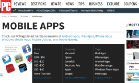
  1. PCMag. PC Mag delivers more than 2,500 product reviews every year. This site offers hands-on reviews for apps from all mobile platforms. Aside from that, reviews include ‘Pros’, ‘Cons’, and ‘Bottom Line’ to give the audience a better picture of the app. There is also a product comparison, wherein your app is stacked against similar apps.

App Review Sites PC Mag Screengrab

  1. Wired. This site is a vital source of information in the ever-changing field of technology. It covers how technology is changing every aspect of life. About 30 million people visit not only the site but also their magazine and social media accounts. The site’s app reviews are insightful. You can learn of the apps’ backstories directly from its developers and founders.

App Review Sites Wired Screengrab

  1. Business Insider. The site uses a fun, concise and informative format of storytelling that heavily leans on positive themes. The site’s ‘Apps Of The Week’ page features lists of best iPhone and iPad apps of the week. It can also include best apps missed that week and app recommendations based on topic. If you think that it’s difficult for you app to get a feature, there’s advertisement option. With this option, the site will feature a full-length article about your app.

App Review Sites Business Insider Screengrab

  1. CNET. CNET offers advice, information, and tools for tech consumers. The site gets about a million visitors every month. The app review process comes in two parts: the first part is a review from a CNET staff and the second part is a user review.

App Review Sites CNET Screengrab

  1. Top Ten Reviews. This review site reviews products from a vast array of categories. They have reviewers and editors that specialize in different products and services. They don’t only review the products, but also research marketplaces for the best options available.

App Review Sites Top Ten Reviews Screengrab

  1. Destructoid. This site is a community for gamers. The site’s audience is almost exclusively gamers and geeky people.An in-house editorial team provides personal and opinionated game critique.  Therefore, reviews are often honest and based on real gaming experience.

App Review Sites Destructoid Screengrab

Viral Loop: The Whys and Hows

User acquisition is becoming more and more expensive. The top 5 CPI countries range from $2.95-$3.37. Also, for an app to reach US top 25 on the iOS charts, an estimated amount of $200,000 need spent on ad expenditures. Therefore, it is safe to say that it is quite expensive to climb up the ranks – that paid promotion is the only way to roll, or is it?


Visibility is still gold but organic downloads seem not enough. Well, unless organic downloads to your app just keep on growing right? That’s when “viral loop” comes in.


So, what is a Viral Loop?

A viral loop is basically a cycle of one app user driving other people into the app. The loop is only considered successful if a.) It is self-fueling, b.) User engagement increases, and c.) Active users increases. Not only does a viral loop drive exponential growth for your app in terms of user acquisition, it also lowers user acquisition costs through viral advertising. But the viral loop won’t just happen overnight. In order for the loop to roll, each of its stages should be properly executed


Viral Loop Stages

Source

  1. See. First, the app needs to have high discoverability. A web presence, specifically social presence is important.
  2. Install. Enticing users to download using rewards or other incentives can be great for the initial downloads and can even get the viral loop rolling but this may not be sustainable in the long run. A great ASO strategy and strong app branding would create a more sustainable way of increasing organic downloads.
  3. Desire to share. An app’s desirable for sharing hinges on two main things: shareable content and achievement-based sharing options. They can share level-ups, share scores to compare with their friends, etc. There should be a social drive in sharing – that sharing would either reward them with social proof or bragging rights. Another great motivation for sharing is in-app incentives (lives, extra moves, power-ups, etc.) that they can receive after sending requests or invitations to friends or contacts.
  4. Share. The viral loop still hinges on the users’ willingness to share in-app content. Aside from providing easy ways for in-app sharing, the app should be engaging enough for the user to have a desire to share whether it be for in-app progress or in the hopes that the in-app action would soon become a trend even among the users’ circle. Unless there’s a two-way engagement between the sharer and the desired audience, the loop won’t go anywhere.
  5. Repeat. Viral loops can either fizzle out, turn to spam or fatigue users. The reason for the first may be the lack of engaging content; the second could be an over-enthusiastic/shrewd approach; or it could be too much, too fast. The goal is to prolong the viral loop’s expiration. Jonah Berger, a Wharton Professor explained: “…things that catch on faster tend to die out faster.”


Viral loops can actually come in many different forms and implementations. You can see it in almost all of the hit apps. The best examples are Candy Crush Saga, Timberman, Snapchat, and much more. There’s no one-size-fits-all when it comes to viral loop implementation. But once implemented right, you’ll find that virality is a force of its own.